Tuesday, December 8, 2009

The witch of the wilds

Morrigan the witch of the wilds.

And a jedi concept

Fennec Fox

This a piece that was a concept for a past assignment.  After a year of practice I decided to revisit the idea and bring a whole knew composition and technique the original can be found here :http://bagginsbaby23.deviantart.com/art/Mechanical-Fennic-103011186

Pastel Collab

This is a collaborative between myself and sir Jeffery Allen Porter the 1st, it turned out very nice.

Thursday, November 12, 2009

Crappily made Disepticons

Ok. So it was not my intention for my series to be soley fantasy art. I want to be able to show clients a variety of styles so, at least in the beginning of my career, I can have as many clients as possible. Later in life when I am sucessful enough maybe then I can narrow it down to what I want. After saying all that, I've only done fantasy and Sci-fi artwork. The next two I will post will be no different.
So my plan after I start and finish my next project (who could pass up doing a Jedi project?) I might do a couple portraits to improve my people painting skills.

On a different note... I had a really cool night! I went to Overland park Kansas to see the singer Mike Mangione perform (really sweet! check him out) so I started sketching him while he was singing. After the show I went up to him to get his autograph and he liked the sketch so much I gave it to him. After I put my name and website on the back :) and he gave me a hug and free CD! Very cool night!

welp g2g I'm watching Transformers 2 and I still don't understand why the desepticons are sooo much larger that the Autobots. It makes Optimus prime so much less cool. plus how do they ever win? I guess the disepticons are crappily made...

Wednesday, November 11, 2009

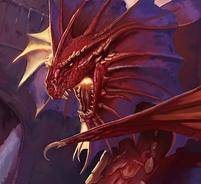
Dragons


I have been working with dragons and am extremely happy with how they turned out.  I used a Todd lockwood book for all the ideas I came up with

Tuesday, October 20, 2009

Old Drum


My long over due drum post

Wednesday, September 30, 2009

Pastel Landscape

2 1/2 hour pastel of the UCM farm

Sunday, September 13, 2009

Watercolor Rodents

Here is what I do at work....  Gerbils!!
And then because I can not resist turning things into something else...A rattata!!!


I just love pokemon....who knows what I'll do tonight at work! :)

Sunday, August 30, 2009

Bouguereau


I have a lot of time at work to do what ever I want so i did a master study....

and then I took t
hat beautiful masterstudy and turned it into fan art :)


destroying classical art one day at a time!!

Friday, August 21, 2009

sneak peak

Here is a little peak of what has come of my complete boredom... DUDUDUUUUUUU Sokka!!!
And a cameo by MOMO

Colors coming SOOOOOOOON.......

Tuesday, July 28, 2009

Final and Reflection


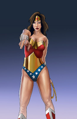
For my final I decided to take Professor B's advice and and do a sort of walk through of my process.  So I worked all week saving at certain points in my progress to then put together as a step by step piece.  Below I will go over where I was at each number.
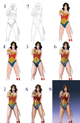


1.  This was my original sketch that I scanned on to my computer.
2.  I did the lines in Illustrator using a calligraphy brush I made.  It was a fixed brush 40% wide.  The small lines were .25 and the larger ones were 1 point.
3.  This is just flat color.  I like to start with an even base. 
4.  I start to add value at a low opacity slowly building up value.  I always build up with a normal brush no soft edges between 35 and 45% opacity.
5.  This is where I started adding detail.  Mostly with all of the gold.  I also added 
more contrast a shadows. I get everything smooth with the band aid brush set to pattern.  The pattern in just plain white no texture.  It's a wonderful tool that Jeff showed me.  I do use the smudge tool to set at 40% opacity.
6.  Face detail and stars put in with pattern tool so they are all accurate.  I had to do each star and then rotate it with the free transform tool.
7.  At this point I'm just trying to bring all the parts of the painting up to the same level.  I also decided that she is to pale.  So after this  I experimented with skin tone to try to 
make her tanner but not orange.
8.  Needed a lot more contrast.
  Looked up gold on google images and used it as reference.
9.  I wanted her to look really muscular so I got pictures of muscular legs and tried to make it believable.  I also realized her bullet blockers are silver not gold :).  And to finish it off a lame gradient in the back ground!!!
And here is the finished piece!!


Sunday, July 26, 2009

another tummy


Just wanted some more practice

Friday, July 24, 2009

Master Study Numero 4


I found this guy on deviant his name is Warren Louw and I really like how smooth his skin is.  Mine.... is not quite so smooth.  I think I might do a couple more studies of him on my own to try and make mine as pretty as his.

Wednesday, July 22, 2009

The Shadow Upon Hyrule

Here is the finished piece.  At least for now.  I need to do my last masterstudy. I am really happy with this one.  I did Zant (creepy guy) completely in photoshop and I can't believe how good he turned out. This is a sketch that I've wanted to color for a long time.

Tuesday, July 21, 2009

Final Piece?

So I have been working really really hard on this.  I've taken everything I've learned and am using it on this one.  My only dilemma is I still have to do a master study for this week.  I really just want to spend all my time on this one to make it as amazing as possible.  It's not done yet, i still have a lot to do.

Sunday, July 19, 2009

Joy


Here is my newest.  I took full advantage of how convenient layers can be with this piece... I think I had 13 total :). I also inlayed some textures, and used the blur filter for some of the background. Another thing that I did in this one that I didn't do in the others is I used a wide variety of brushes.  I also had a lot of reference pictures.  I'm pretty happy how it turned out and can't wait to start the next one!

Wednesday, July 15, 2009

Super Quick Grayscale Study


Here is a quick sketch and greyscale study for my next project it took me about five minutes to do both..  now that it's up it is much lighter than it looked in photoshop.  I need more contrast.

Tuesday, July 14, 2009

The gaurdians pillar finished


I believe this is the finished version.  Among other things I enlarged the hand, laid a marble texture and put a light layer of a goldish color over the top to tie it all together.

Master study 3


My study is on top the original is on the bottom.  I got the image from a magazine.  I had the two images laid out next to each other for comparison but the file uploaded wrong and I couldn't get it to work.  I used a lot of layers and tried really hard to match the colors by Eye rather than using the eye drop tool to get the exact color.

Sunday, July 5, 2009

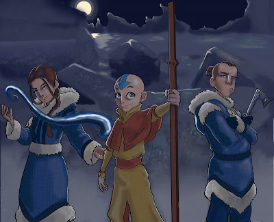
Aang and the Gang UPDATE!!! Please view


I stuck with avatar for my piece and wanted to create a scene. I chose to have it be at night because I wanted to play with rim lighting. It was sooo much fun. Aang is just to cute.
Anyway... I did all of the lighting on a separate layer and the lines in illustrator with a calligraphic brush. I have never been so happy with my lines before. So I will definitely be playing with that more in the future.


I have added texture to the clothes please tell me what you think!!!

Thursday, July 2, 2009

Second Master Study

This is my second master study.  I scanned in the picture and did the lines in illustrator.  Then in photoshop I colored it and overlayed a texture.  There isn't a texture in the original but it needed something.  


The original is below :)

Monday, June 29, 2009

I can be a little slow at times.... mentally

So... just spent forever working on that huge extremely difficult master study and then realized all I had to do was a tiny little section.  Whenever I checked the other posts I saw these wonderful pieces (like Ryan's and Jakes)  and thought they did those full scale studies.  And both of you are very good but I was floored at the craftsman ship of those pictures.  And I admit I am really relieved that those are the masters works.  So from now on I'm going to do  little square so I don't have to kill myself trying to get out two full pieces every week. 

P.S. If I am wrong please correct me :)
Casndice

Saturday, June 27, 2009

First master study


So this is my first attempt at recreating a digital piece.  It took an insane amount of time. So I think I need to find a faster technique. I sketched the picture and then scanned it in.  I didn't trace it because I couldn't find a large picture of the picture I wanted.  That made it pretty difficult as well.  It's hard to match up a small amount of pixels with a large amount.  Anyway, I like how it turned out especially since I don't know what I'm doing.


And here is the original By Todd Lockwood

Sunday, June 21, 2009

Just Some Sketches


There are a lot of deer that run outside my windows, or at least they did when I lived at a friends and even though these weren't them. They definitely inspired me to sketch deer.  There were not lions however......


Be Kind to Those You Love....


Painting people you are close to is so.....scary.  No not quite the right word; intimidating.  You never want to make them any different than they appear, but you still have to make the painting your own.

The Shire

I don't normally do anything 3-D but I had to for class so this is the latest thing I've done.  But this I think actually turned out good!!