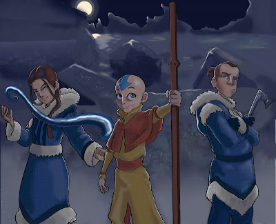
I stuck with avatar for my piece and wanted to create a scene. I chose to have it be at night because I wanted to play with rim lighting. It was sooo much fun. Aang is just to cute.
Anyway... I did all of the lighting on a separate layer and the lines in illustrator with a calligraphic brush. I have never been so happy with my lines before. So I will definitely be playing with that more in the future.
I have added texture to the clothes please tell me what you think!!!

You did a great job capturing the likeness of the characters. The only suggestion i might have is check you light source. It looks like the moon is the only light source and that would make them back lit were Aang was a a spotlight on his head.
ReplyDeleteThis looks really nice! I'm impressed at how much you've improved just over the last few months. Even the rocks in the background are interesting.
ReplyDeleteI love the these characters you did a great job giving them personality. You did a real good job with shifting the color spectrum of the local colors to make it look like they are all being lit by the same color light. I do agree with jake about some rim lighting on the figures and maybe slightingly brighter saturated colors in the immediate foreground to give it more depth.
ReplyDeleteIt looks Great.
Well the lighting on the front of the figures is from the snow. I tried to take into account that snow is still very bright even at night and the reflective qualities of the environment. Maybe I shouldn't have worried about that since this is a cartoon lol
ReplyDeleteVery nice piece Candice! You captured the characters personalities (eh eh Sokka) and my how you digital coloring has improved. I say congratulations to that my friend. :)
ReplyDeleteFor the lighting I have an artist to recommend. You may have seen some of his books in my apartment but you can find his work floating around the internetz... ( I am so GEIL! )
http://hyung-taekim.org/gallery/index.php
HTK's pieces are great examples on how to capture dramatic lighting on characters and also the use of the aerial perspective colors.
Have a look see and keep on rocken' my dear.
I thought I commented already, I guess it didn't post. Anyway. Love the variable line work! Next step, look at texturizing somehow the more blurry parts to bring them back into focus. The texture doesn't have to match the form for it to work. Throwing a slight canvas onto the clothes for example would really bring them back to the foreground.
ReplyDeleteAhh good idea!! I will definitely do that and repost!
ReplyDeleteGood job with the texture, it looks great! You might try putting in a different texture on the two outside figures, maybe something kind of furry looking. The middle one looks just right for what he is wearing.
ReplyDelete